Henderson’s Relish is a dark, spicy table sauce which has been produced in Sheffield since 1885. Although much loved in its home city, up until a few years ago it could only be found on sale in Sheffield and North Derbyshire. Thanks to a business expansion programme, which included moving to a new factory in 2013, availability has now increased to the rest of Yorkshire and beyond. Improvements to their packaging have played an important part in this. Below I explain how the company has made the most of new branding and label layout, a bespoke glass bottle and the introduction of shelf-ready packaging. If you are interested in how to increase distribution and sales of your product using packaging, read on (Disclaimer: I have not worked on this, I just think they have done a really good job! Please get in touch or call me on 07826 791 045 if you want help with your packaging development though).
1. Graphic Design and Label
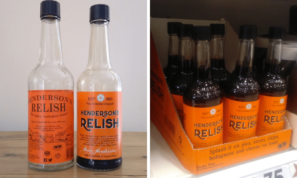
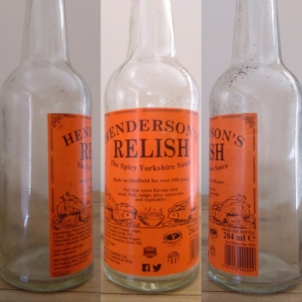
To most Sheffielders, the sight of a clear half-pint bottle filled with a dark brown liquid and with a bright orange label is unmistakably Henderson’s Relish. Until their rebrand in 2015 the label design had remained pretty much unchanged for decades. There was no logo as such – the bottle pretty much being its own logo and the type was simple capitals, reminiscent of old-style letterpress printing. All pack information, including awards and the barcode, was visible on a single face. The result was that it looked rather cluttered – OK if the product is on sale in a local butchers, but far from ideal for supermarkets and convenience stores, where the packaging needs to do the selling.
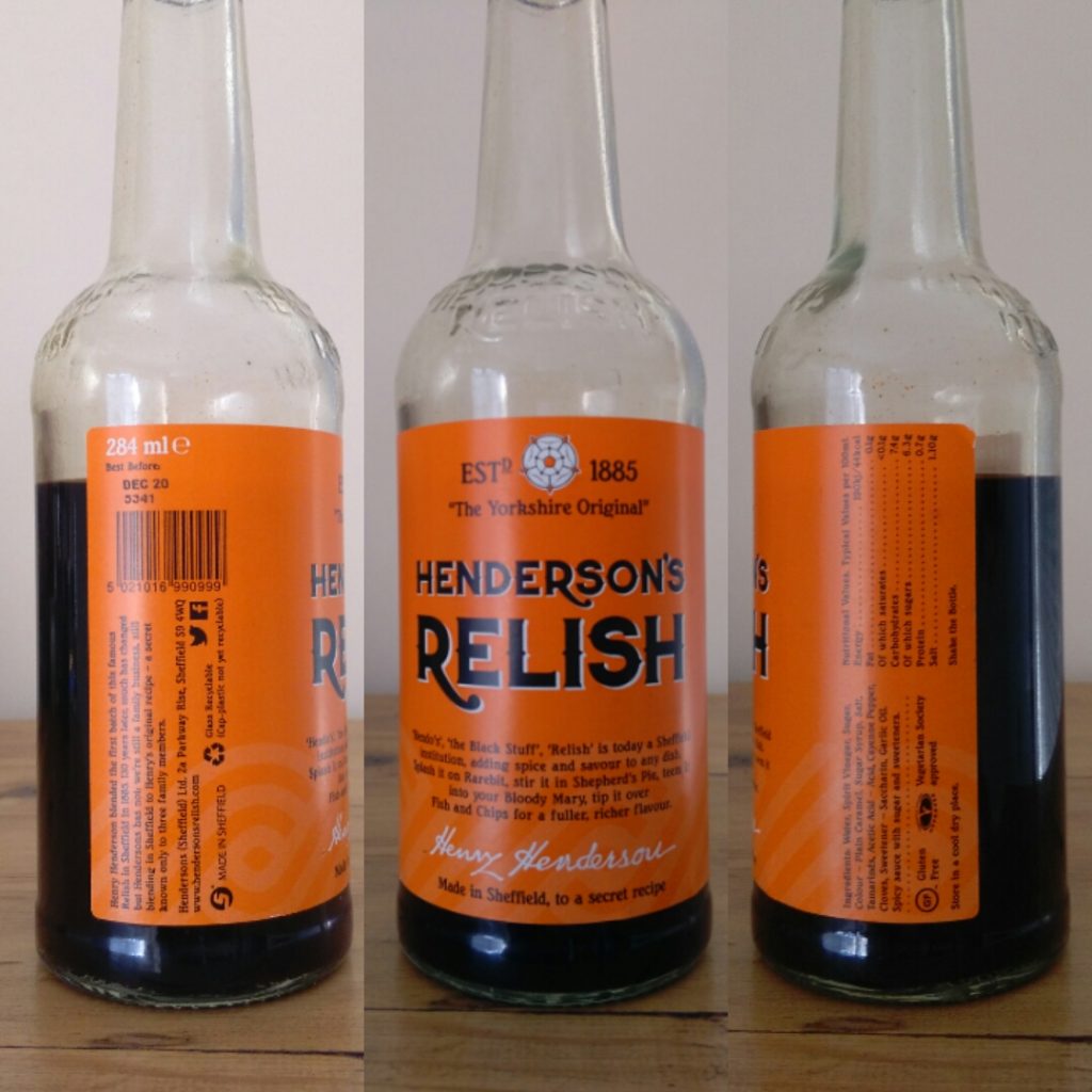
For the new design, they have introduced a Victorian style font, sticking with uppercase letters. The strokes of the letter Rs extend below the baseline, turning the product name into a logo. The white Yorkshire rose now sits above the text, showing the brand’s provenance, white highlights on the lettering complement the rose. Founder Harry Henderson’s signature has been added to the base of the label and a subtle background texture breaks up the solid orange background.
The layout of the label is much neater. Although shorter, it has been made bigger so it wraps further around the bottle, and front and side panels have been introduced. The barcode, accolades and newly added nutritional information are now hidden on the sides of the bottle rather than the front, creating a much neater appearance.
2. Bottle
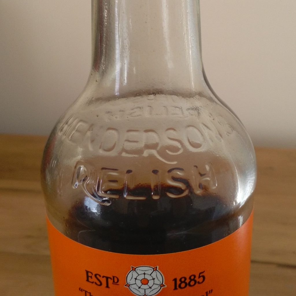
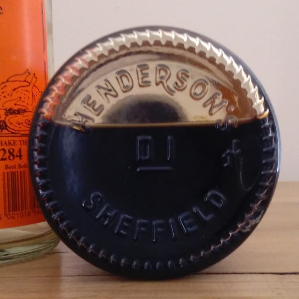
Although Henderson’s used bespoke embossed bottles in their early days, more recently they had been using a generic half-pint bottle. They returned to their roots in 2017 with a bottle produced by nearby leading glass manufacturer Beatson Clarke. ‘Henderson’s Relish’ is now proudly positioned in relief on the shoulder and even the base. This gives a real feel of class – in order to have bespoke bottles for your brand, there is a significant minimum order quantity and the associated tooling costs. To someone who has not come across the brand before, this says ‘we are here, we are reliable and we are going to be around for a long time’.
The glass itself is 30% recycled, 10% is from locally recycled glass – a great story which reinforces their Made-in-Yorkshire credentials.
3. Shelf-Ready Packaging
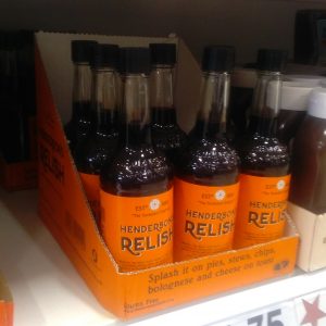
Along with other requirements, major retailers will often not list a product unless the outer packaging meets their specifications. They will have strict guidelines on the type of packaging and how it is labelled and palletised. It is common for them to insist on shelf ready packaging (SRP or RRP), outer packaging that can be opened quickly and place directly on the supermarket shelf without the need for decanting. Originally in an ordinary brown cardboard box with cardboard dividers to protect the bottles (like a crate of wine), the dividers have been done away with and the top portion of the box is easily ripped away to reveal the contents inside. This SRP is printed in Hendo’s Orange, and they’ve jumped on the opportunity to add serving ideas and their gluten-free and vegetarian credentials to the part of the packaging which stays on the supermarket shelf, turning it into a valuable marketing tool.
So what next for Henderson’s ?
Combined, the above changes have transformed a very ordinary-looking local hero into a product that looks worthy of any upmarket supermarket or farm-shop shelf. Over the period that most of these changes were introduced, sales increased by 30% (Sheffield Star, October 2016). Clearly this hasn’t been entirely down to the packaging, for example Henderson’s are very good at taking advantage of publicity opportunities, Hendogate, for example, and futher establishing the brand by producing special editions. When the new design was launched In 2015 their aspirations were just to conquer Yorkshire. Now they have invested in a new bottling line and are planning to go global (Yorkshire Post 2017). The changes to the packaging that have been made over the last few years have set them in excellent stead for this.
To see how I can help your business grow using new packaging, check out the case studies and services provided pages on my website. For more information, contact me here, call me on 07826 791 045 or subscribe to my monthly newsletter

